
There was a bit of a flurry on Twitter this morning as Zoom introduced it’s response to MS Teams’ feature placing people on a video call into a picture of a virtual classroom.
In the current version of @zoom_us, you can rearrange participants while in Gallery view. Zoom are taking this concept further by introducing "immersive scenes", allowing hosts to set a custom background theme/layout.
More Info: https://t.co/MhgOo6aWMA #Zoomtopia pic.twitter.com/LLOgFqoQ1T
— Tim Stringer (@timstringer) October 14, 2020
Vicki Dale posted this in response…
Plus it replicates the all-importance of the lecture for information transmission …
— Vicki Dale (@vhmdale) October 15, 2020
…which reminded me of something I’d heard lexicographer Erin McKean talk about at a conference years ago* that stuck with me: the concept of Skeuomorphism.
Skeuo…what?
Skeuomorphism is a design and UX technique that carries over features of previous technologies into new ones even though they don’t provide any useful function.
If you remember the way Apple’s iOS used to look before they introduced their current “flat” design ethos, you might recall things like the icons for Newsstand, Notes, Compass and a few others. They borrow design elements from their physical counterparts as you can see in the Before and After image below.
What’s the point of Skeuomorphism?
The point is to introduce a feeling of familiarity and comfort into an interface. Designers use things we recognise as a way of easing us into transferring practice from one system to another. In the old iOS Notes app, it actually looked like a paper pad, the designers hoping we would take the visual cues and instinctively know what it was for and how we should use it.
This performs a useful function, particularly when trying to migrate people to a new way of doing things without wanting to overburden them with “newness”. This is a situation that many people have found themselves in recently when moving teaching and learning into online environments.
And that is what Microsoft and Zoom are trying to do here. The “together” view adds very little to the core functions of either system, but creates an interface and operating environment that is supposed to be familiar and reassuring.
So what’s wrong with that?
It’s not going to bring about the end of the world but there are two main problems; one about design and the other about practice.
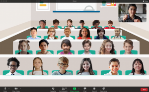
Firstly, design. Looking at the example in the tweet you can see that the layout of virtual classroom but to add to the verisimilitude, or similarity to life, there’s a lot of design clutter. And to accomodate the false perspective it’s a lot harder to make out the features of the participants at the back of the room.
Which brings us to the second point about practice. As Vicki pointed out, the false perspective also potentially affects relationships. What does it mean to be “sat at the front” versus being at the back. What does that do to the behaviour of the teacher or the students?
More importantly, Vicki’s second point is about what it means for pedagogic practice. By incorporating a design element like this, the implication is that learning is about being sat in rows having information delivered to you, something that many teachers have strived for years to break free from but remains a stubbornly persistent perception of how teaching should happen.
Many of the issues faced by universities and colleges during the pandemic revolve around the expectation by either staff or students that quality learning experiences should confirm to a particular type and its a challenege to demonstrate to people that other methods are equally good or even better.
Is it all Zoom’s fault, then?
Of course not. This is a relatively minor update to the way the system works. If I’m being cycnical then I’d say it’s a fun gimmick that gets attention on social media but once the novelty wears off, its usefulness recedes.
It’s more of an indication of a bigger set of assumptions that get in the way of thinking about practice differently.
If we design a virtual environment that needlessly incorprates the constraints of another older system it then makes it harder to innovate or think creatively about how we use these virtual spaces.
With any new innovation in technology it’s always worth testing it against 2 questions; how does this impact on my relationship with people and how does it affect my relationship with information.
I’ll let you draw your own conclusions about virtual classroom views.
* I’m only 65% certain that it was Erin McKean who talked about it at the conference but hopefully there’s no harm done. She’s an excellent person to know about.